TABLE OF CONTENTS
Freddy AI Copilot's curated value report gives support administrators and managers a centralized framework for measuring the strategic value of AI across their customer support operations. The reports convert raw usage data into actionable business key performance indicators (KPIs) and time-saving figures, so you can communicate operational effectiveness to stakeholders and leadership.
In this article, learn how to read and act on each of the seven reporting tabs in the Freddy AI Copilot reporting suite.
Capabilities of Value Report
The reporting suite is designed to answer the questions that matter most to CX leaders and support managers:
- Analyze ROI: Quantify financial impact by applying agent hourly rates to the total time reclaimed through AI assistance.
- Track CSAT impact: Correlate AI usage with customer satisfaction scores and resolution quality to build a data-backed case for Copilot investment.
- Evaluate feature impact: Measure how individual capabilities—such as Solution Article Suggester and Writing Assistant—contribute to reduced handle times and overall efficiency.
- Monitor customer sentiment: Understand how sentiment shifts across ticket journeys to surface coaching opportunities and confirm that AI assistance is improving customer experience.
Reporting tabs
The reporting suite is organized into seven specialized views. Each tab answers a distinct business question:
Tab | What it answers |
Summary | How is AI performing at a glance? What are my top KPIs and who are my AI champions? |
Adoption | How deeply is AI being used across agents and tickets? Where are the gaps? |
Impact | Is AI improving CSAT and resolution times? What does the cohort data show? |
Breakdown of Features | Which individual AI tools are being accepted or rejected? Where is training needed? |
Feature Usage (With Feedback) | Which AI features are agents using, and do they like them? Track acceptance rates and feedback signals side by side. |
Feature Usage (Without Feedback) | How accurately and efficiently are individual AI features operating? Dive into generation counts and acceptance benchmarks. |
Sentiment Analysis | How is customer sentiment trending over time, by agent, and by group? Use this view to connect AI behavior to emotional outcomes. |
Summary tab
The Summary tab provides an executive-level overview of your AI deployment and its immediate effect on support productivity. Use this tab to report high-level ROI to stakeholders and to identify internal AI champions who are making the most effective use of the toolset.
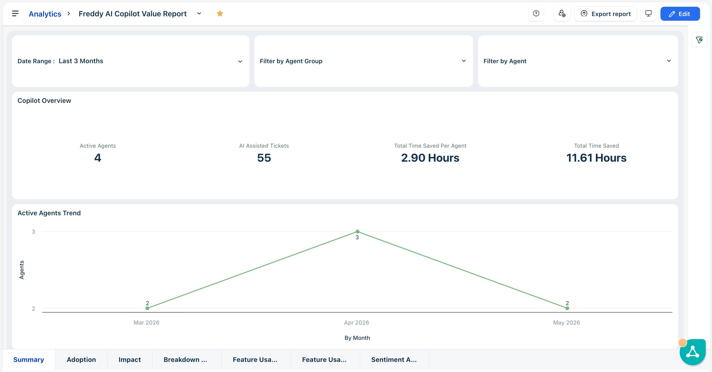
View aggregate performance under Copilot overview
The top row of the dashboard displays cumulative KPI widgets that quantify the immediate footprint of AI in your support operation.

Key metrics in the table
Metric | What it means |
Active agents | Number of agents who used at least one Freddy AI Copilot feature in the selected date range. The percentage change indicator compares the current period to the previous period. |
AI-assisted tickets | Total tickets where an agent invoked at least one Copilot feature. Use this as your primary volume benchmark for AI utilization. |
Time saved per agent | Average time reclaimed per agent through AI assistance. Multiply by the hourly rate to calculate per-agent cost savings. |
Total time saved | Aggregate productivity reclaimed across the entire support team for the selected period. |
Note: The Active Agents Trend line chart plots the count of agents using Copilot features over time. An upward slope confirms that AI adoption is growing organically. A plateau or decline warrants investigation using the Adoption tab.
Compare performance trends
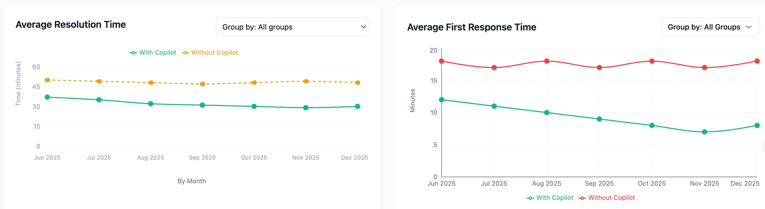
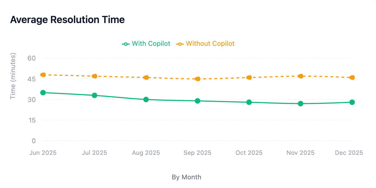
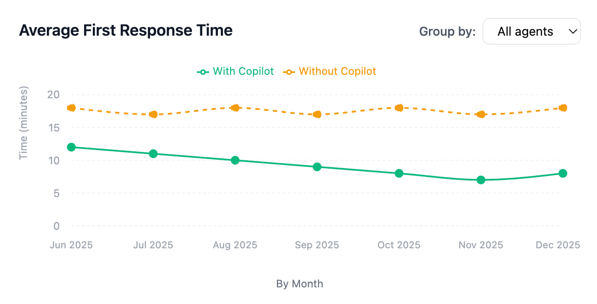
The Average Resolution Time and Average First Response Time line charts track support efficiency over time. Both charts use the same two-line convention:
Metric | What it means |
Solid green line | Tickets where at least one Freddy AI feature was used (With Copilot). |
Dashed orange/red line | Tickets handled without any AI assistance (Without Copilot baseline). |
How to interpret the trend charts
The vertical distance between the two lines at any point in time quantifies the speed advantage that AI provides. A consistently lower green line confirms that Copilot is accelerating resolution and response times.
- Downward slope on the green line: A declining With Copilot line over multiple months indicates that agents are becoming more proficient with AI features—efficiency compounds as familiarity grows.
- SLA validation: If the Without Copilot baseline holds steady or rises while the With Copilot line drops, this is strong evidence that AI adoption—not other factors—is driving improvements. Present this gap to leadership as quantified ROI.
- Converging lines: If the two lines trend toward each other, investigate whether agents are using AI on low-complexity tickets only. Broaden training to encourage use across more ticket types.
Most features used
The Most Features Used horizontal bar chart ranks each Freddy AI Copilot capability by the number of tickets it assisted. The x-axis represents ticket count; longer bars indicate higher adoption for that feature.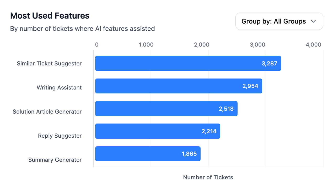
How to interpret the chart
- Identify efficiency drivers: Features at the top of the list represent the primary sources of reclaimed time. Solution Article Suggester and Writing Assistant are consistently leading contributors to productivity.
- Spot training gaps: A high-value feature appearing low on the list—such as Summarize showing fewer interactions than expected relative to total eligible ticket volume—indicates an awareness or training gap rather than a product limitation. Schedule targeted enablement sessions.
Top agents leveraging AI
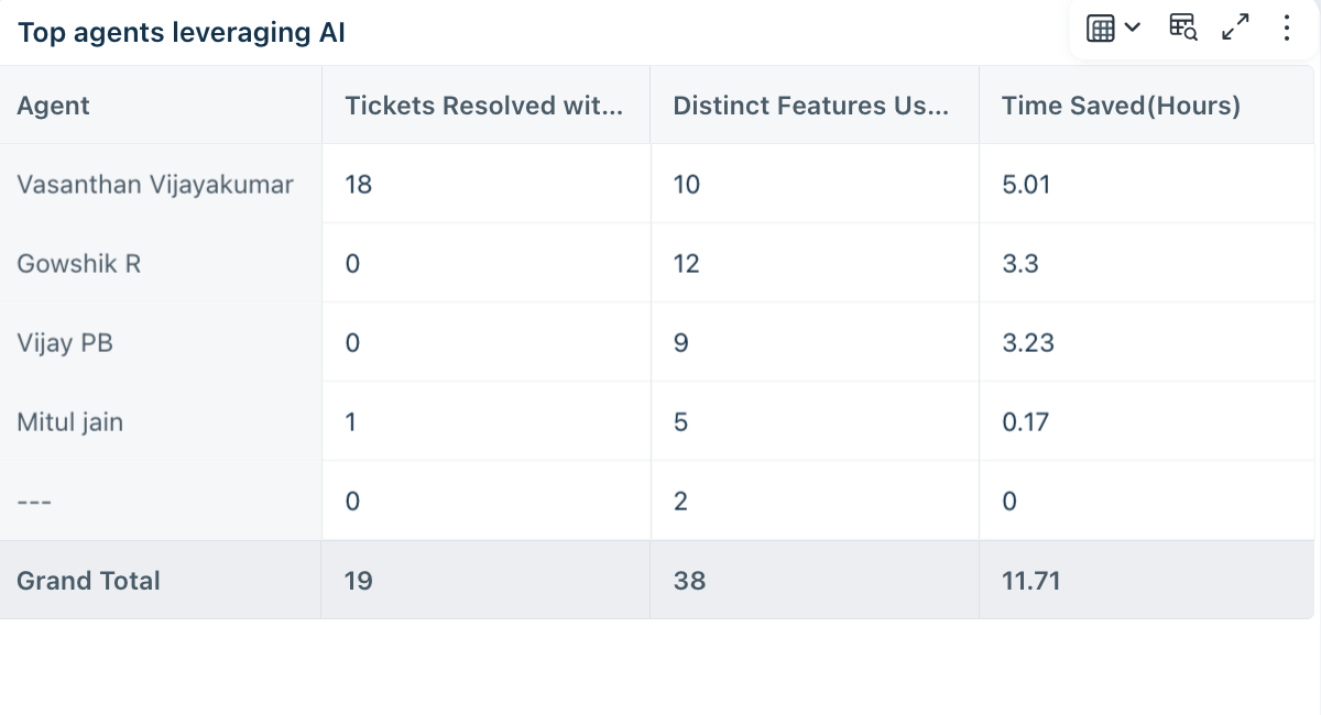
The Top agents leveraging AI table identifies individual contributors who most effectively integrate Copilot into their resolution workflows. These agents serve as measurable AI champions within your team.
Key metrics in the table
Metric | What it means |
Tickets Resolved with AI | Total tickets closed in which the agent used at least one Copilot feature. High counts validate consistent AI engagement. |
Distinct Features Used | Total number of unique AI features invoked. A higher value indicates comprehensive suite adoption rather than reliance on a single tool. |
Time Saved | Total hours reclaimed by the agent compared to their own manual baseline. |
How to use this data
- Establish best practices: Agents at the top of this table use multiple features per ticket. Interview them to document which feature combinations yield the highest time savings, then share those workflows across the team.
- Set adoption targets: Use the Distinct Features Used column to set a team-wide benchmark. Agents with fewer than two features per ticket are prime candidates for targeted coaching.
Adoption tab
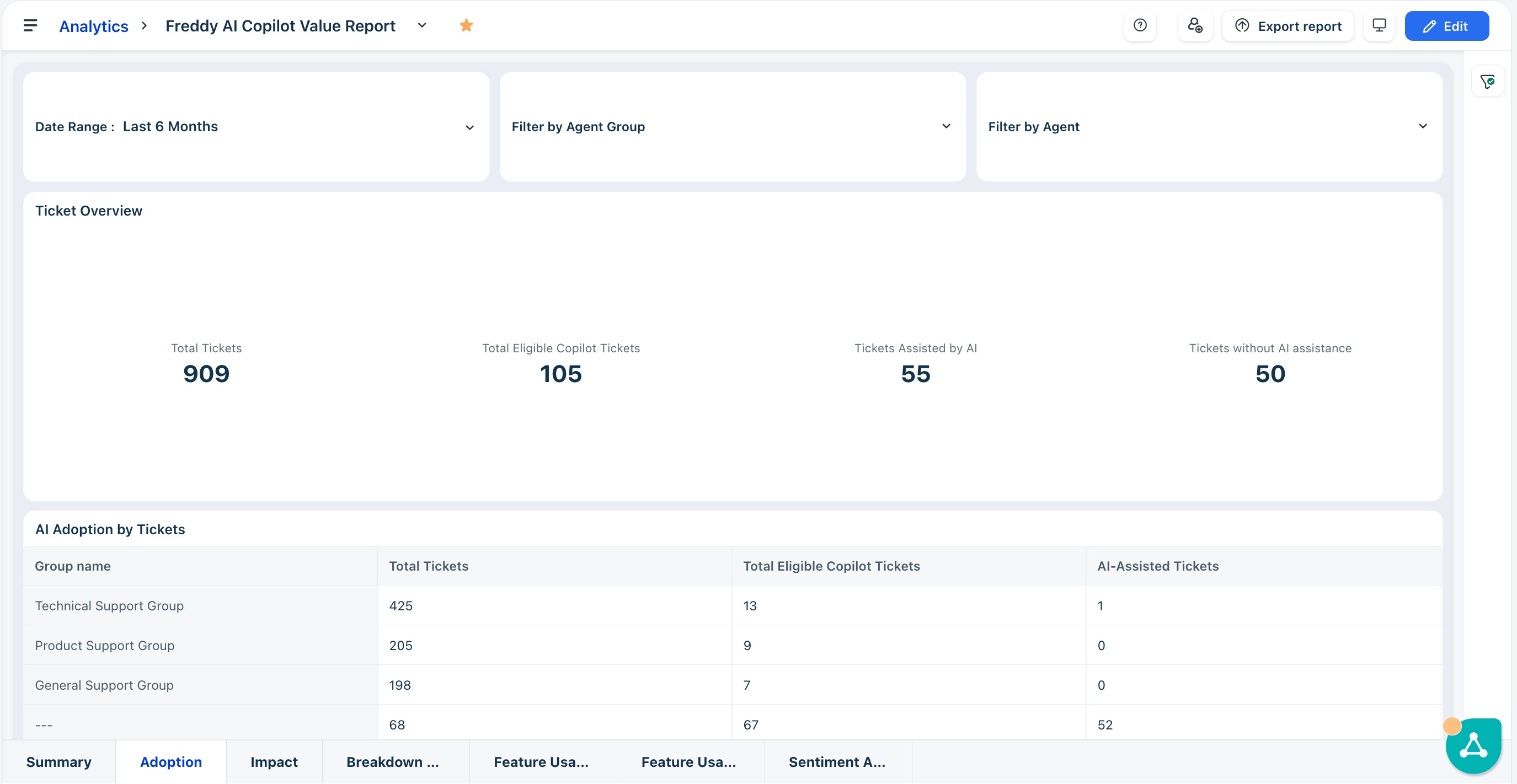
The Adoption tab measures the depth and breadth of AI integration across your support teams. Use this tab to identify friction points in your rollout, track seat utilization, and set data-driven targets for onboarding programs.
Ticket overview
The Ticket Overview section gives you a snapshot of how broadly Freddy AI is touching your support volume. Use these metrics to assess overall AI saturation before drilling into team-level breakdowns.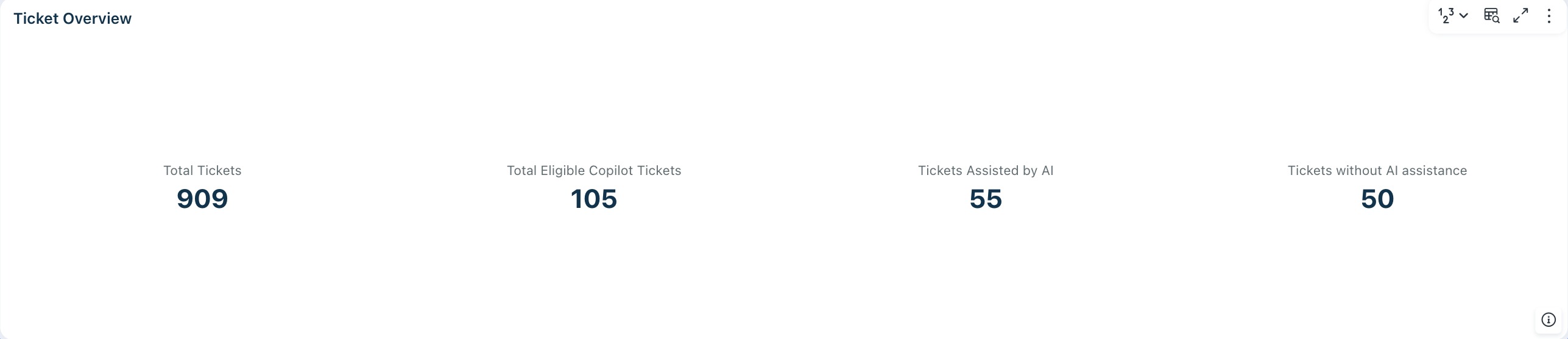
Key metrics in the table
Metric | What it means |
Total Tickets | All tickets received in the selected date range. This is your baseline for understanding the scale of support operations during the period. |
Total Eligible Copilot Tickets | Tickets where your Copilot-licensed agents were assigned and able to assist. This represents your current AI coverage—expanding it through additional licenses and broader agent assignment directly increases the value you capture from AI-powered support. |
Tickets Assisted by AI | Tickets where an agent actively used at least one Copilot feature. The ratio of this to Total Eligible Copilot Tickets is your AI Assistance Rate—the headline adoption metric for executive reporting. |
Tickets without AI assistance | Eligible tickets where no AI feature was used—your unrealized opportunity. A declining count here signals that AI is becoming a consistent part of the standard resolution workflow rather than an occasional tool. |
AI adoption by tickets
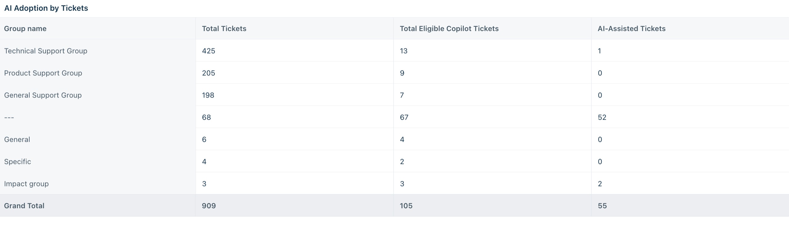
The AI Adoption by Tickets table breaks down ticket volume and AI assistance per agent group, helping you pinpoint which teams are driving AI-assisted resolutions and which are lagging.
Key metrics in the table
Column comparison | What to look for | Action |
Total Tickets vs. AI-Assisted Tickets | Calculate a group-specific AI Assistance Rate | Groups with a low ratio despite high ticket volume are your highest-impact enablement targets—small behavior changes here will move your overall adoption number significantly. |
AI adoption by agents
The AI Adoption by Agents table shifts the lens from tickets to people, showing how many agents within each group are actively engaging with Copilot and how productive they are.

Key metrics in the table
Column comparison | What to look for | Action |
Active AI Users vs. Total Users | Groups approaching 100% show strong buy-in | Use high-adoption groups as internal champions. Investigate low-ratio groups for workflow blockers, insufficient awareness, or onboarding gaps. |
Avg Tickets Handled — All Users vs. AI Users | AI Users handling higher average volume than all users in the same group | Validates efficiency gains for that group and strengthens the business case for expanding Copilot access. |
Tip: Sort the AI Adoption by Agents table by Active AI Users to immediately surface groups with the lowest engagement. For groups where Active AI Users represent less than 50% of Total Users, schedule a dedicated enablement session and follow up with agents showing zero usage.
Impact tab
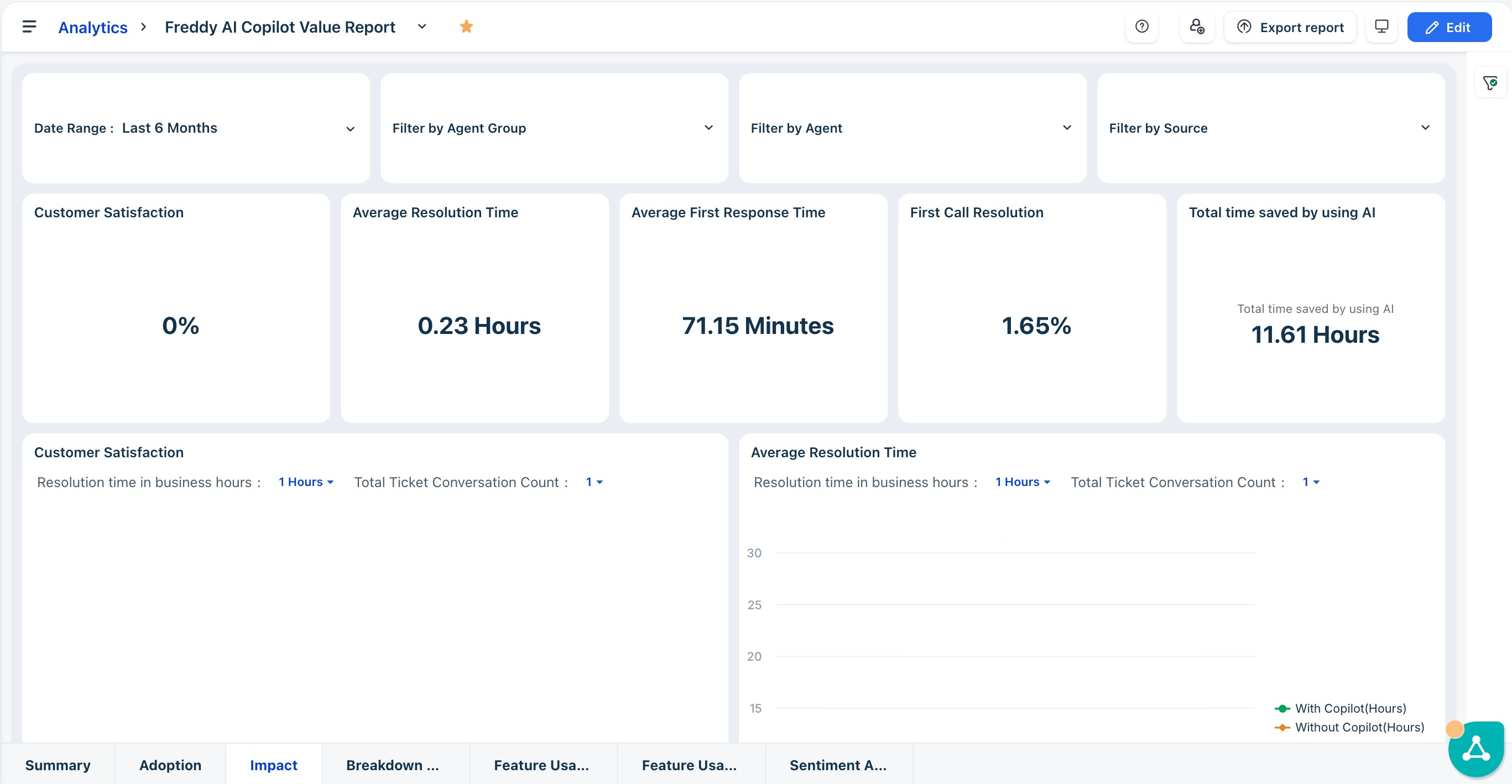
The Impact tab correlates AI usage with your critical service metrics—resolution times, first response times, CSAT, and first call resolution. This strategic view demonstrates that AI assistance not only saves time but also improves service quality and resolution accuracy.
Use this tab to build the business case for AI investment and identify where Copilot is delivering the most measurable value to customers and agents alike.
Note: If metrics aren't trending in the expected direction, it doesn't necessarily mean Copilot isn't working. It could signal an adoption gap, or that agents are routing Copilot toward more complex tickets where resolution naturally takes longer. Segment by ticket complexity and usage frequency before drawing conclusions.
Top-line KPIs
These metrics give you an at-a-glance view of AI's operational impact. Track them over time to quantify efficiency gains and surface areas where Copilot is underperforming.

Key metrics in the table
Metric | What it means |
Customer Satisfaction (CSAT) | Overall satisfaction score for the selected period. Track whether CSAT improves as Copilot adoption increases—this is the headline quality signal for customer experience leaders. |
Avg Resolution Time | Average time taken to fully resolve a ticket. A declining trend in AI-assisted tickets indicates that Copilot is helping agents close issues faster. |
Avg First Response Time | Average time before an agent sends the first reply. Lower values signal that AI suggestions are helping agents respond to customers more quickly. |
First Call Resolution (FCR) | Percentage of tickets resolved in a single interaction. An upward trend suggests AI is helping agents arrive at the right answer without back-and-forth. |
Total Time Saved by Using AI | Cumulative hours reclaimed across all agents as a result of AI assistance—your headline efficiency metric for executive and finance reporting. |
Average resolution time
This chart plots resolution time for AI-assisted tickets against non-assisted tickets over the selected period, making the productivity delta immediately visible. Use it to confirm whether Copilot is helping agents close tickets faster and to track efficiency trends month over month.
Key metrics in the table
What to look for | Why it matters |
With Copilot trending below Without Copilot | Confirms that AI assistance is directly contributing to faster resolutions—the core efficiency argument for Copilot adoption. |
Gap widening over time | Indicates that agents are becoming more proficient with AI tools, compounding efficiency gains as adoption matures. |
Lines converging or crossing | Warrants investigation—agents may be over-relying on AI suggestions without review, or the ticket mix may have shifted toward more complex issues. |
Average first response time
This chart compares first response time between AI-assisted and non-assisted tickets, surfacing whether Copilot features like Reply Suggester are reducing the time customers wait for an initial reply.
Key metrics in the table
What to look for | Why it matters |
With Copilot trending below Without Copilot | Validates that AI suggestions are reducing the time agents spend crafting initial responses, directly improving the customer experience. |
Sharp early drop in the With Copilot line | Suggests a cohort of highly engaged agents driving outsized gains—identify them and replicate their workflows across the team. |
Without Copilot line at or near zero | May indicate that non-AI-assisted tickets are being resolved without an explicit first response—cross-reference with ticket closure data to confirm. |
Tip: Use the Resolution Time in Hours and Total Ticket Conversation Count filters on each chart to control for ticket complexity. High-conversation tickets naturally take longer to resolve—isolating low-conversation tickets gives you a cleaner read on AI's direct impact.
First call resolution
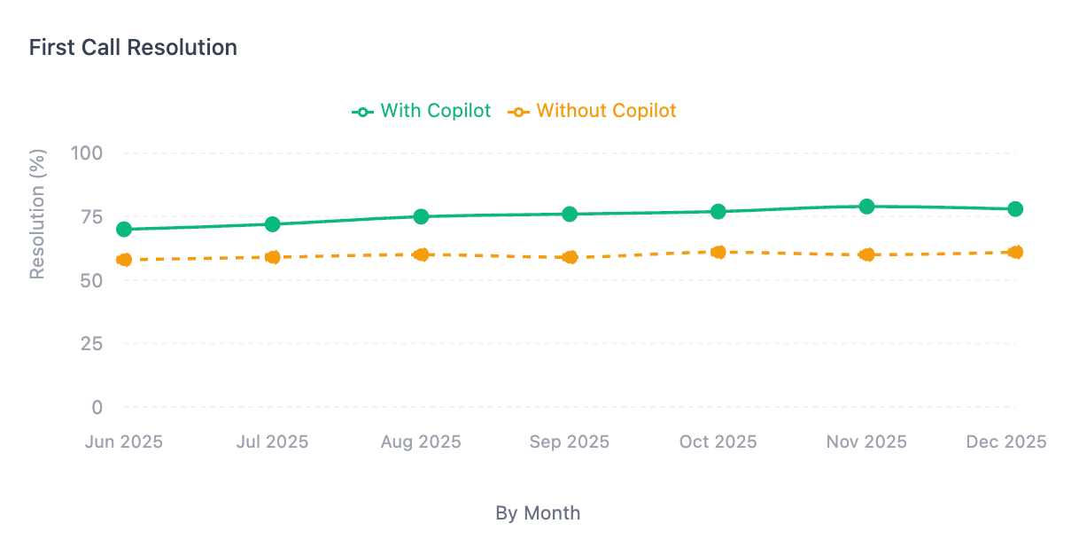
This chart compares the FCR rate between AI-assisted and non-assisted tickets, showing whether Copilot helps agents resolve issues fully on the first interaction without requiring follow-up conversations.
Key metrics in the table
What to look for | Why it matters |
With Copilot FCR rate higher than Without Copilot | Confirms that AI context—such as similar ticket suggestions and knowledge base insights—is helping agents resolve issues completely on the first attempt. |
With Copilot rate growing month over month | Signals that agents are becoming more effective at leveraging AI to diagnose and resolve issues faster, reducing the back-and-forth that drives up conversation counts. |
No data for First Call Resolution | Indicates insufficient ticket volume in the selected period to calculate FCR. Broaden the date range or reduce group filters to surface data. |
Breakdown of features tab
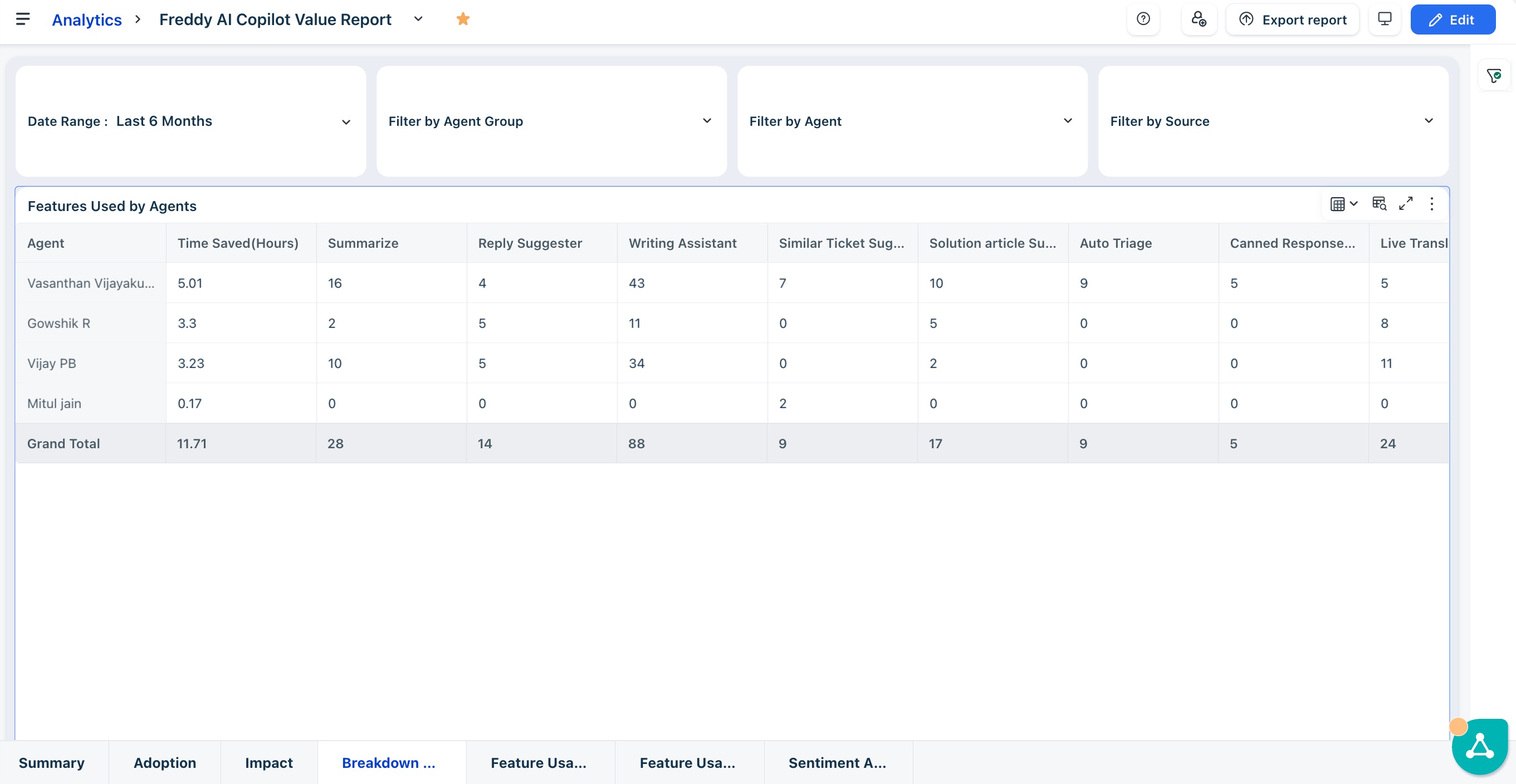
This tab shifts the focus from overall AI performance to individual feature-level behavior, showing which tools agents are using, how frequently, and how much time each is saving. Use this view to identify training gaps, surface power users, and prioritize enablement efforts by feature.
Features used by agents
This table maps each agent's usage count across every Copilot feature alongside their total time saved, making it easy to spot both breadth of adoption and individual efficiency gains.
Key metrics in the table
Metric | What it means |
Time Saved | Your per-agent efficiency headline—agents with high time saved but uneven feature usage may be over-relying on one or two tools. |
Summarize, Reply Suggester, Writing Assistant | Core workflow features—low counts here suggest the agent hasn't integrated AI into their day-to-day ticket handling. |
Solution Article Suggester, Similar Ticket Suggester | Secondary features that indicate deeper Copilot engagement—adoption here signals an agent moving beyond the basics. |
Auto Triage, Canned Response Suggester | Efficiency and routing features—usage depends on team configuration and ticket type, so benchmark within relevant agent groups rather than across the board. |
Tip: Agents with zero usage across all features but a non-zero Time Saved value may have indirect AI exposure through automation rules. Validate whether these agents need hands-on onboarding or are already benefiting passively.
Feature usage (with feedback) tab
This tab pairs feature-level adoption metrics with direct agent feedback, giving you a side-by-side view of how frequently each AI tool is being accepted and whether agents are signaling satisfaction or dissatisfaction with its suggestions. Use this view to prioritize which features need prompt tuning, additional training, or broader rollout.
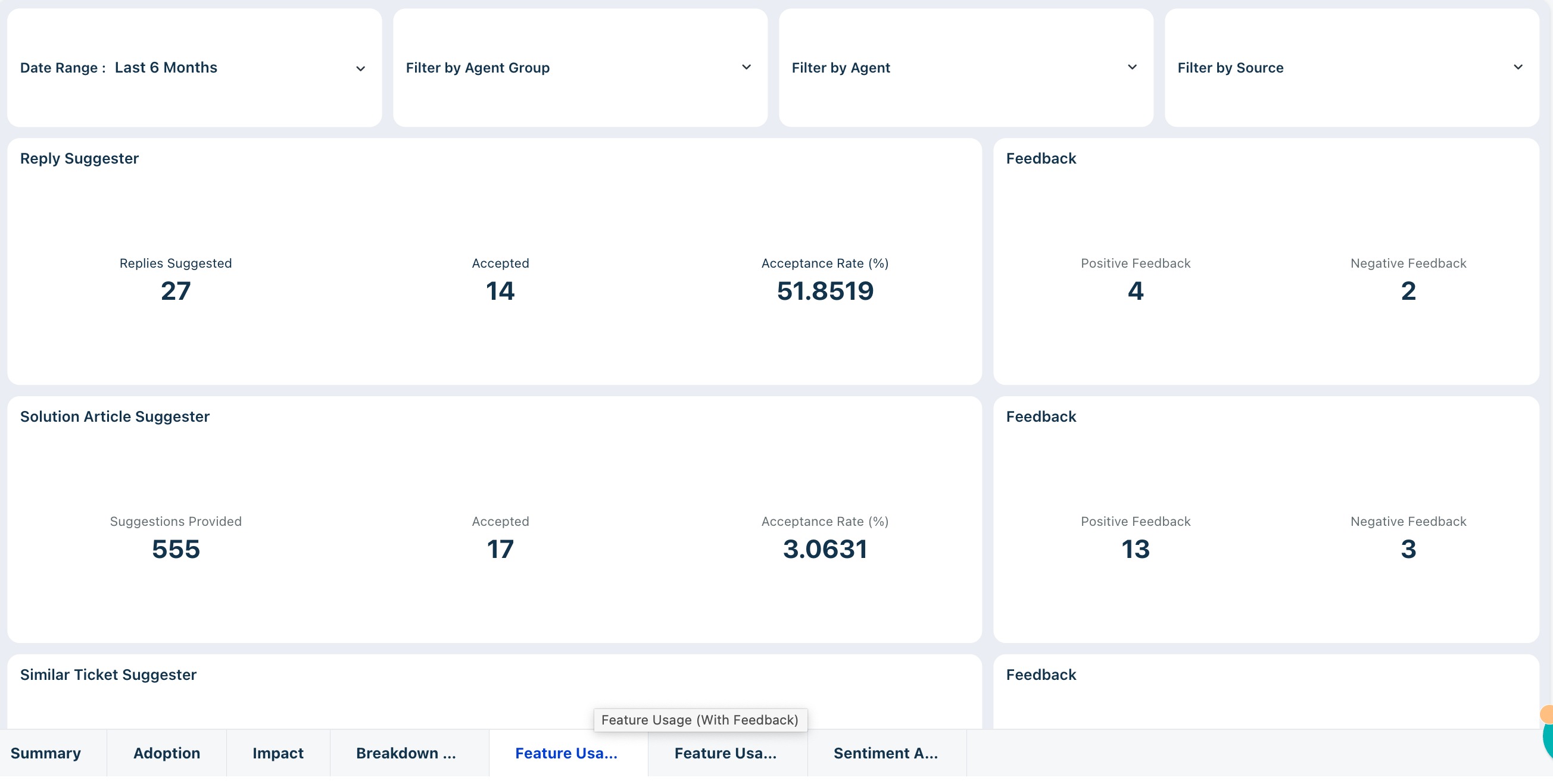
Read each feature card
Each feature is presented as a pair—usage metrics on the left, feedback signals on the right. Together they tell a complete story: a high acceptance rate with no feedback may indicate passive usage, while a low acceptance rate with negative feedback points to a feature that needs attention.
Key metrics in the table
Metric | What it means |
Acceptance Rate (%) | The percentage of AI suggestions that agents actively accepted. This is your primary signal of whether the feature is generating useful, contextually relevant output. |
Suggestions / Content Generated | The total number of times the feature was triggered. A high count with a low acceptance rate indicates the feature is being surfaced frequently but not trusted. |
Accepted | The raw count of accepted suggestions. Track this alongside the rate to understand both quality and volume of value delivered. |
Positive Feedback | Agents who explicitly marked a suggestion as helpful—a strong signal that the feature is meeting expectations for that ticket type. |
Negative Feedback | Agents who explicitly marked a suggestion as unhelpful—a direct indicator that prompt quality, tone, or relevance needs improvement for that feature. |
Tip: Features with zero positive and zero negative feedback are not necessarily underperforming—agents may simply not be using the feedback mechanism. If acceptance rates are healthy but feedback is absent, introduce a team norm around rating suggestions to build a richer signal over time.
Feature usage (without feedback) tab
While the Feature Usage (With Feedback) tab reflects agent sentiment and usage trends, this tab shifts the lens to objective performance. It shows how each Copilot feature is operating, measured by generation counts, acceptance rates, and feature-specific output metrics—independent of user feedback.
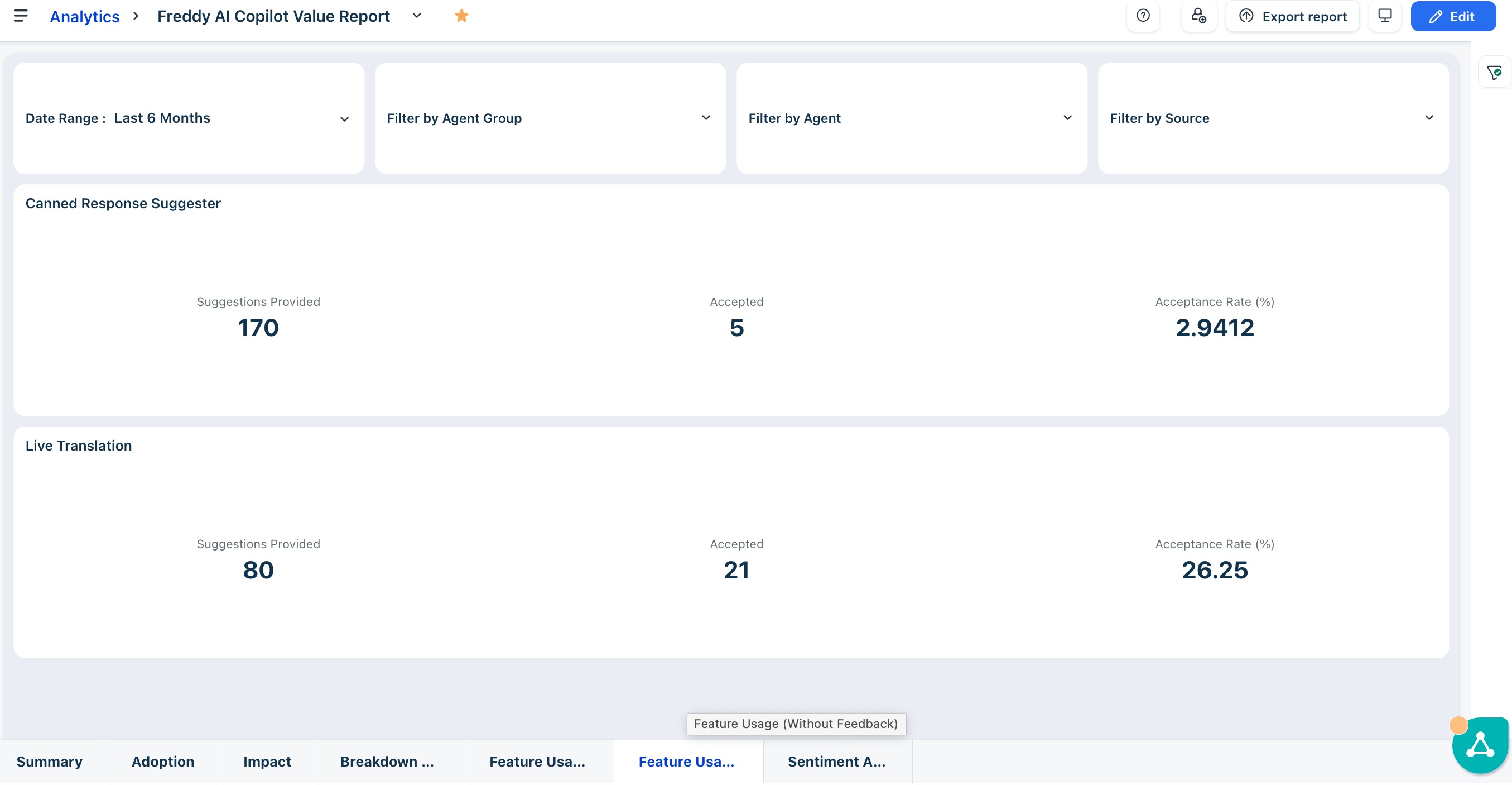
Read each feature card
Each card surfaces three metrics that together reveal the operational health of that feature. Use them to benchmark individual tools against each other and track improvement over time.
Key metrics in the table
Metric | What it means |
Acceptance Rate (%) | The share of generated outputs that agents accepted without discarding—your primary indicator of output quality and relevance for that feature. |
Output Count (Suggestions / Translations generated) | The total volume of AI outputs produced. High volume with low acceptance points to a feature being triggered frequently but not trusted. |
Accepted | The raw count of accepted outputs—use this alongside the rate to understand both quality and absolute value delivered. |
Tip: Features with a high acceptance rate but low output volume are performing well but underutilized. Features with high output volume but low acceptance rate—such as Solution Article Suggester—are your highest-leverage tuning opportunities: small improvements to output quality here will have an outsized effect on overall AI value delivered.
Sentiment analysis tab
The Sentiment Analysis tab connects AI-assisted ticket handling to the emotional journey of your customers. Unlike SLA metrics—which measure speed and process adherence—sentiment data reveals whether the quality of support interactions is actually improving customer experience. Use this tab to identify which agents and groups are consistently turning around negative situations, and where coaching is needed.
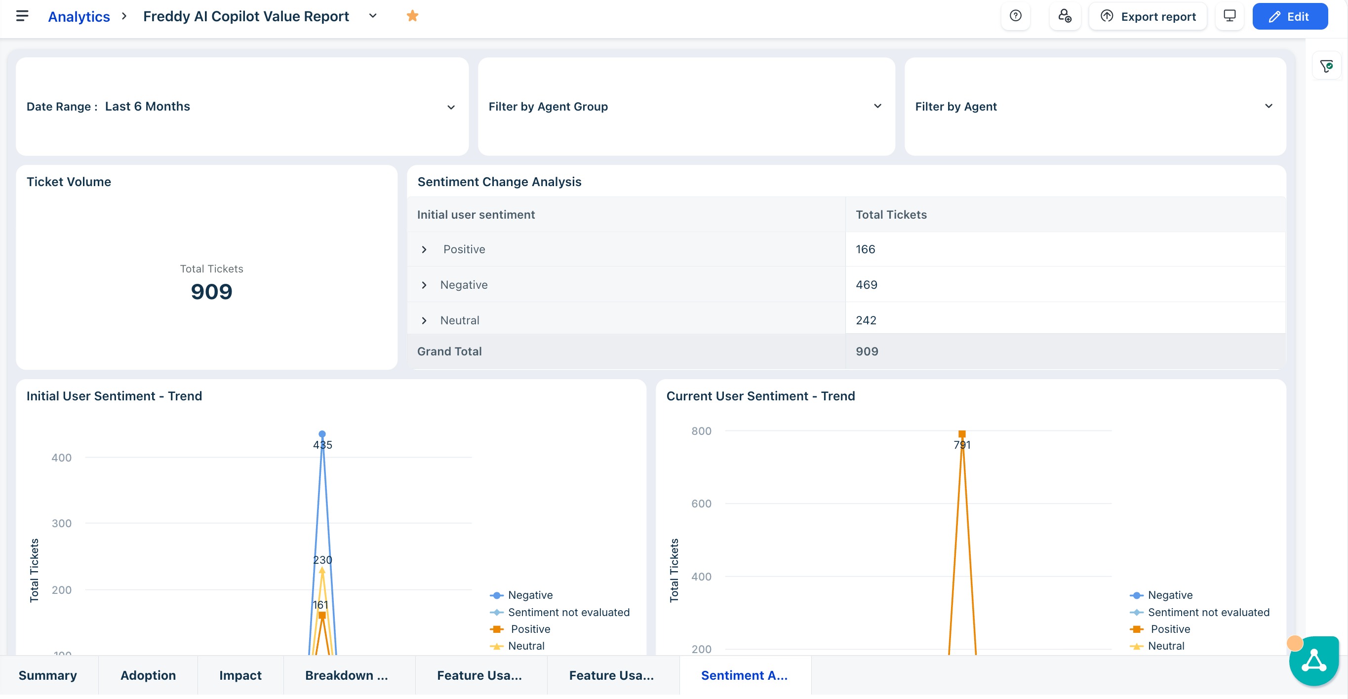
Track sentiment at a glance
The Ticket Volume widget confirms the total ticket count for the period. The Sentiment Change Analysis table shows how customers arrived—positive, negative, or neutral—at the start of their interaction, giving you a baseline for assessing how your team is handling emotionally charged tickets.

Key metrics in the table
Metric | What it means |
Initial user sentiment | The emotional tone of the customer at the start of the ticket—positive, negative, or neutral. A high proportion of negative initial sentiment is expected in support contexts; what matters is whether that sentiment improves by resolution. |
Current user sentiment | The customer's sentiment at the most recent interaction point. Comparing this to Initial Sentiment reveals whether agents are successfully de-escalating or if frustration is building over time. |
Interpret the trend charts
The Initial User Sentiment Trend and Current User Sentiment Trend charts plot sentiment counts over time, allowing you to correlate changes in AI adoption with shifts in customer emotional outcomes.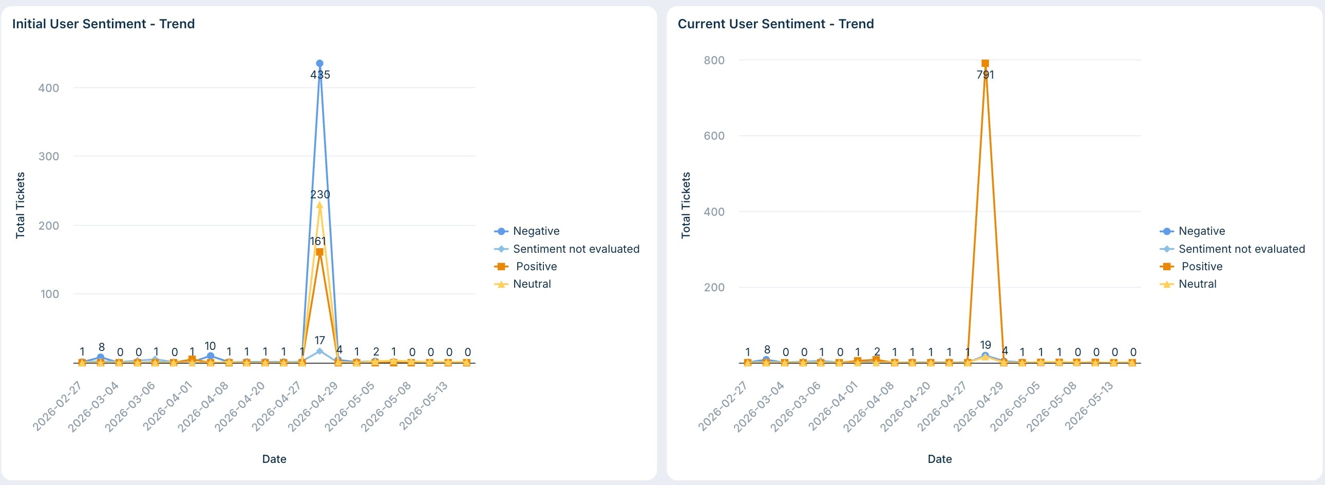
- Declining negative count in Current Sentiment vs. Initial Sentiment: A meaningful signal that Copilot is helping agents respond in ways that de-escalate difficult conversations.
- Rising positive count in Current Sentiment: Confirms that AI-assisted responses are landing well with customers and contributing to a better overall support experience.
- Flat or worsening sentiment despite increasing AI use: Investigate whether agents are using AI suggestions without adequately reviewing them for tone—particularly for emotionally sensitive tickets.
Analyze sentiment by agent and group
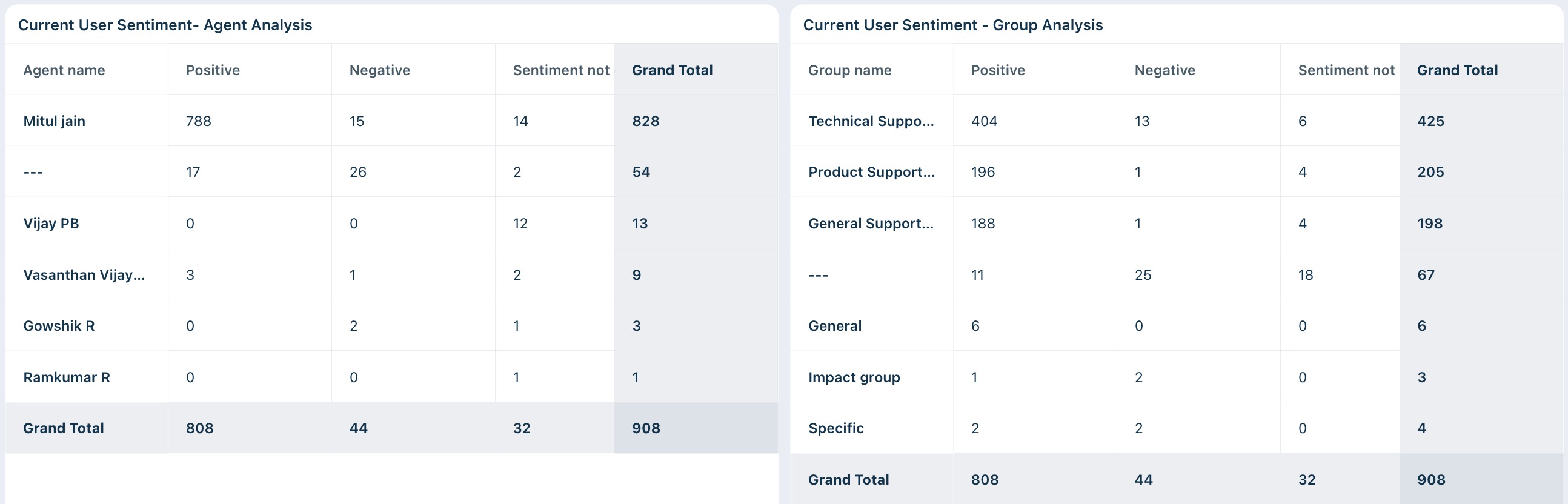
The Current User Sentiment — Agent Analysis and Current User Sentiment — Group Analysis tables break down sentiment outcomes at the individual and team level, making it easy to pinpoint specific coaching opportunities.
How to use this data
- Identify sentiment leaders: Agents with high positive and low negative current sentiment counts are your customer experience champions—understand their approach and replicate it.
- Surface coaching targets: Agents with disproportionately high negative current sentiment relative to ticket volume may need coaching on how to apply AI suggestions in emotionally charged situations.
- Benchmark by group: Use the Group Analysis table to compare sentiment outcomes across teams. Groups with consistently high negative current sentiment may need additional enablement or workflow adjustments to get the most out of Copilot.
Tip: Cross-reference sentiment data with the Breakdown of Features tab. Agents with high negative sentiment but low usage of Writing Assistant or Reply Suggester are prime candidates for targeted coaching on how these tools can help craft more empathetic, effective responses.