Website forms are easy to build but difficult to attain conversions. Forms often demand a user’s personal data, time and effort. Behind every successful and unsuccessful form submissions, there are always a few hidden form metrics that are to be analyzed.
One main reason that stops a user from signing up or a cart abandonment would be the dreadful forms with endless fields. From checkout funnels to subscription forms, every website has at least one form that is decisive to a site’s success.
So how do we optimise these forms? Form Analytics.
Why need form analytics?
Find what stops a user from submitting a form in a website.
- Examine user behavior on web forms.
- Measure granular performance of online forms.
- Find the fields that are ambiguous and erroneous.
The following justifies the need for form analytics on a website:
To know what annoys the user in your form
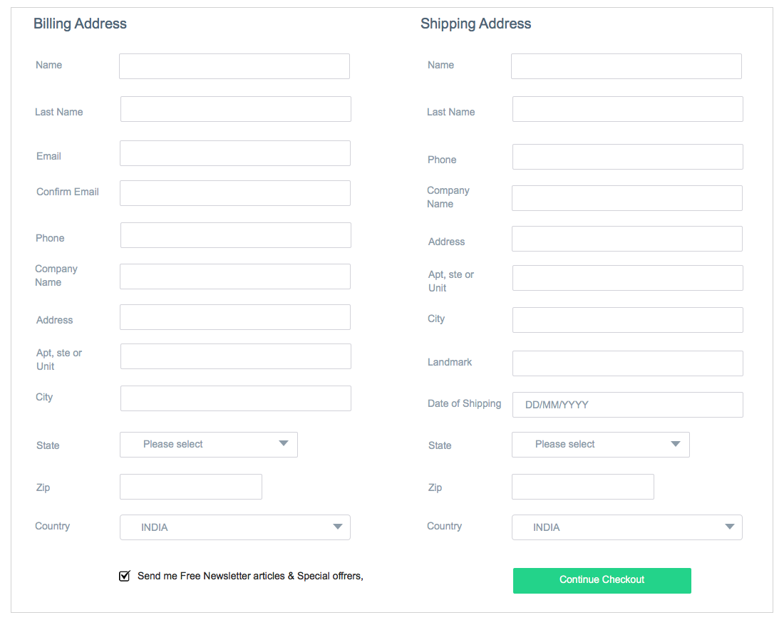
Let's say there is an E-commerce site, Ecart and their site is designed with a shipping information form and a billing information form at their checkout page. Making a checkout process painless is the key to increase ROI for a business.
Ecart has the below design for the checkout page:
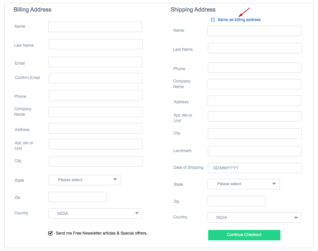
In a closer look, both the forms have certain fields in common. In most of the cases, users use the same address and city for both billing and shipping information. Duplicating the same information in two forms might make users get frustrated which in turn will create loopholes(leaks) on your checkout page.
Running form analytics in the above form will clearly show the drop off fields and this has made Ecart redesign their checkout page form.
Setting an option for the user to duplicate the information from one form to another can save a user’s time and effort in filling up the form. With Freshmarketer’s hesitation time report, one can easily track the fields that users hesitate to fill in.
To find the leaking fields in the web form
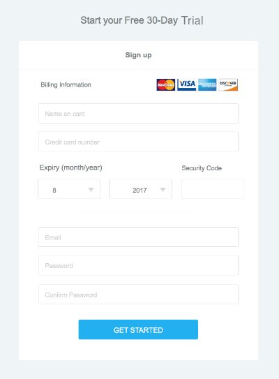
Assume Getcab has a product for people looking for an affordable transport. Getcab has a signup page with a signup form.
Signup page has the following fields:
This web form asks for information on a credit card which is sensitive to a user. A user might leave the form without subscribing or signing up, as the user finds hesitant providing confidential details. Here, Getcab asks for credit card details for a free 30-day trial subscription.
A user might either leave this form empty or may even abandon the form after filling out the residual fields. Form conversions would be less as users find the more confidential fields in it.
Fields that are abandoned and left blank by the visitors can be identified with Freshmarketer’s drop-off and blank field report.
To find how long users take time to complete a web form:
Few form fields require more time to fill in than the other fields. To name a few: credit card, upload images or documents, bank details, insurance id, loan id takes much time to fill-up than other fields.
Taking a closer look at these fields, we can find a common characteristic of gathering information that is not easily available. The user may need to refer values from a document or an email. Not every potential user will be in a motive to submit the form. Few fields in your web form can urge the user to abandon the form and this will result in a failed form submission. Freshmarketer generates form report with an insight on how long does it take for a visitor to submit a form through average time spent and average time to complete metrics in the form reports.
Read this article for more information on creating a form in Freshmarketer.
Technical Support


